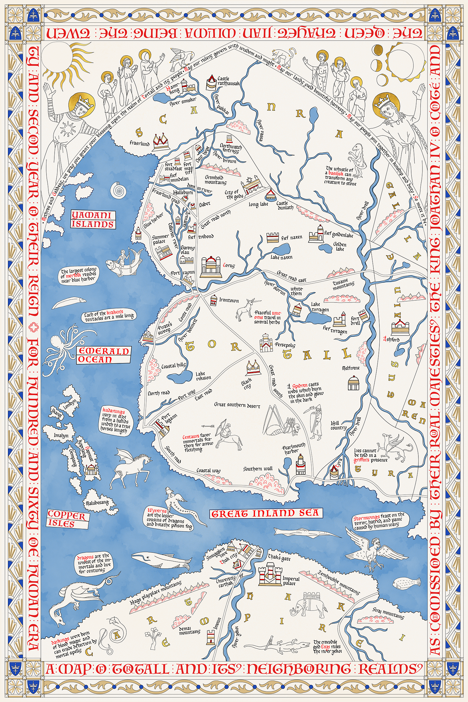
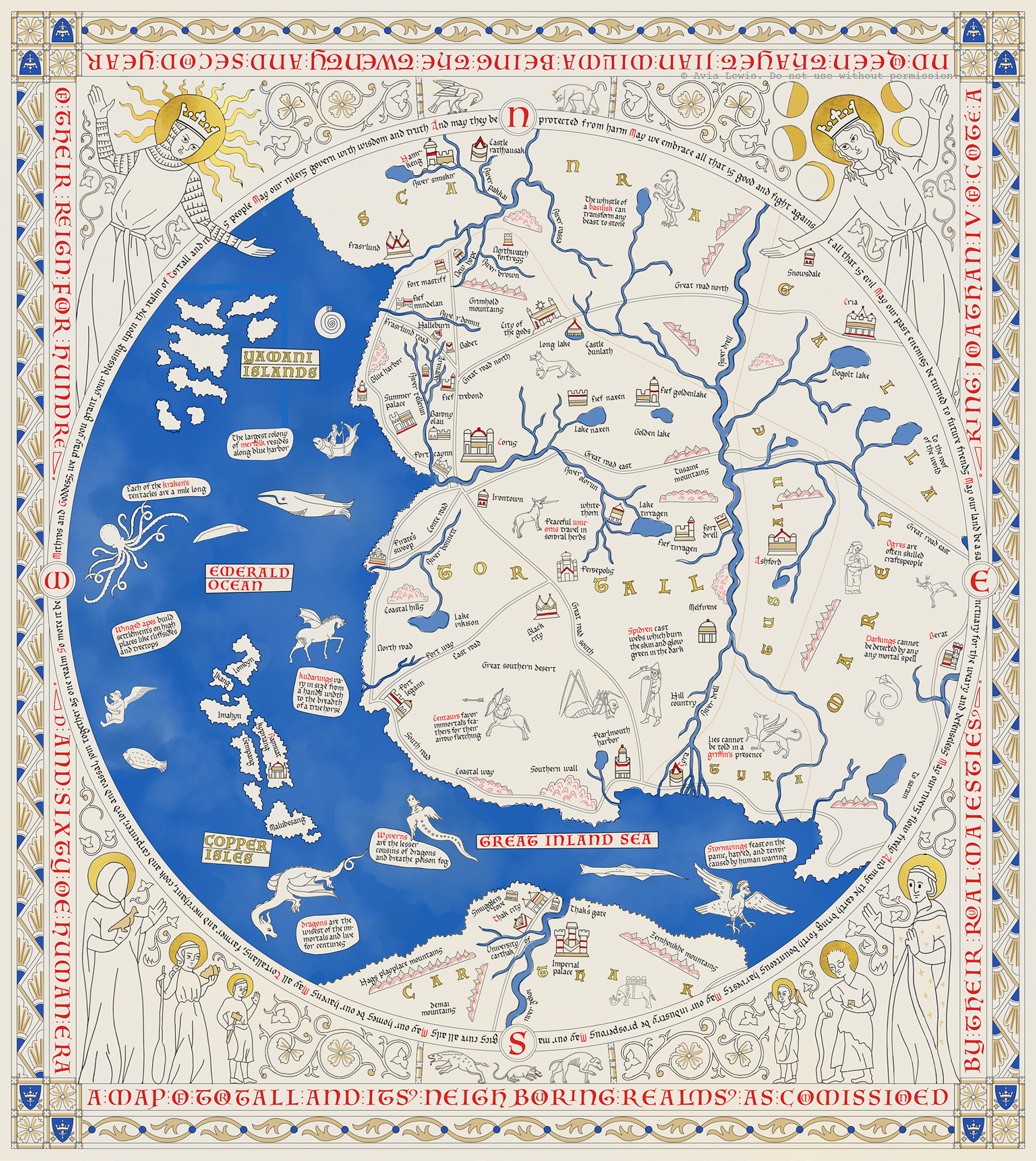
An ongoing adventure in history and prop-making. Below is a preview of what will become a tangible, hand-traced and gilded map inspired by those of the Late Medieval period. I'm currently adding the finishing details to the design, filling in the last empty spots in the border.
Want to know when the map is completed and available for sale? Enter your email below, and I'll send you a note when I have a relevant update. (And you'd also be doing me a favour, since having "interested audience" numbers will increase my chances of getting the map officially licensed!)
You're on the list now. Thank you!
I will not share your email address with any person or company, and I will not send you any other emails.
Tamora Pierce's Tortall Universe, spanning six book series, is a vibrant, detailed fantasy realm inspired by many real-world cultures. Tortall, the central country, is based heavily on medieval Europe.
At the front of every book is a map. It’s usually small, black and white, and fairly basic—which is perfect for publishing, but just asking for a Late Middle Ages revamp. I envisioned a full-color, full-size, fully medieval map hanging on my wall.
So, the master plan: create a roughly poster-sized map, beginning by collecting existing references. Create a digital drawing plan. Trace the finished design with calligraphic ink and paint. Apply gold leaf, then give everything a proper 1300's patina. Here we go!
First things first, I combed through the internet, the local library, and my bookshelves to collect all existing maps of Tortall. Then I laid them over each other, matching points as best as possible.
I traced over each map to create a "mega map" with all the known points of interest on it. I then searched the novels and the Tamora Pierce Wiki for extra points to add, and inserted those guesses as semi-transparent points.
Then with help from The British Library's manuscript collection, I researched medieval maps and settled on The Hereford Mappa Mundi as my main design reference. (See all my medieval illustration references and their use here.)
I searched online for a good body typeface, but nothing quite fit. Instead, I learned how to create fonts with FontForge, traced letters from the Hereford Mappa Mundi, and created a more Hereford-accurate typeface (with allowances for extra legibility).
I began with the border design and then started tracing over the Mega Map. It was difficult to balance map accuracy and medieval design aesthetic: would it be better to spread out the cities to give the map an even fill, or keep them where they should be? Include the terrain, or keep everything flat?
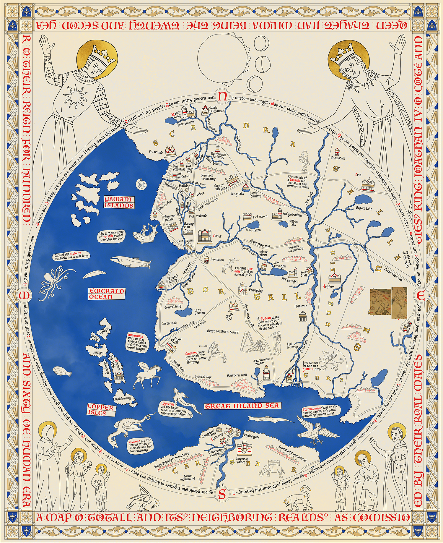
After playing around with the layout, I conceded that the right half of the map didn’t have enough places of interest to balance the left half, so it needed to be cropped it in on the country of Tortall. And to make it look more medieval, it needed a more intricate, multi-level border.


I settled on a circular border with an even top and bottom (pictured at the top of the page). Then to fill in the rest of the empty space, and to follow in the footsteps of the Hereford Mappa Mundi, I added a mini-bestiary of mythical creatures that appear in the books, and filled in the inside borders with symbols from the Tortall books' religious systems.
Although there's much more to do, I'm very happy with how it's coming together. I'm currently adding the finishing details to the design, filling in the last empty spots in the border. Then it's on to inking the real thing. Stay posted as I update this project!
